
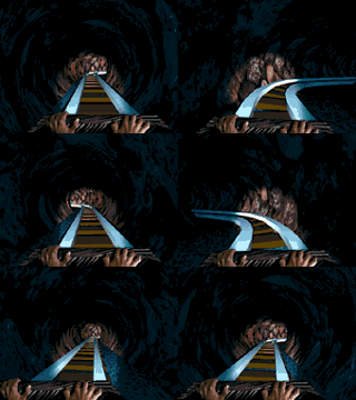
One of my favourite video game related "hobbies" has always been Rollercoaster Tycoon custom builds. I love building thematic rides with cool designs and appropriate decor. It has the same creative sensation as working on a new illustration--only thing is--of course, i'm playing a video game instead of drawing. I was never a big fan or attendee of theme parks, it was the creative process that hooked me. It's like gamemastering for DnD, you create a cool world for others to explore, that, I think is what I enjoy most. Here are some OpenRCT2 builds that're apart of various park projects.
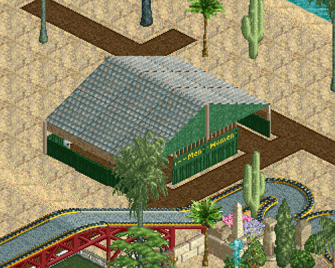
This is a simple bathroom I created after going on a date in Pebble Beach. I saw a similar looking bathroom sitting along the shore and thought it had an alluring shape and colour that needed recreation in one of my parks. The bathroom itself features two seperate bathrooms, which mechanically does nothing, however I wanted to be faithful to its real world counterpart.
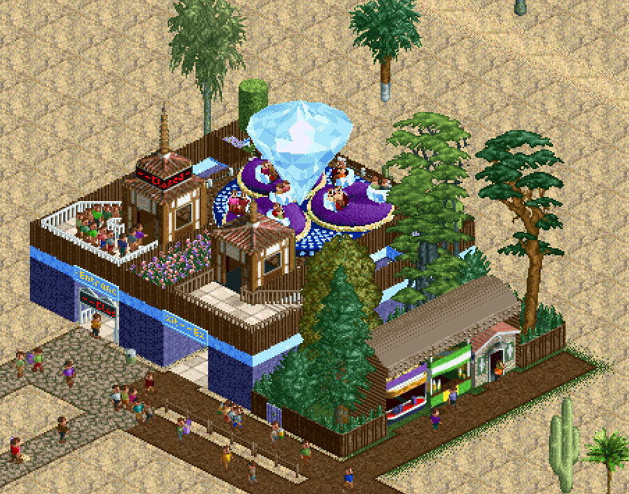
This diamond themed thrill ride was something simple to test colour palletes. Using a thrill ride instead of a coaster, I was fully able to focus on the design of the building as opposed to the structure as a whole. The building itself is very simple, but I admire its simplistic beauty, which I attribute to the colour pallete. Unfortunately for me, I accidentally sunk all my money into this as the first ride of a scenario! So I was stuck waiting for this miserable thrill ride to make enough money to buy a junior coaster lololo. Lesson learned!
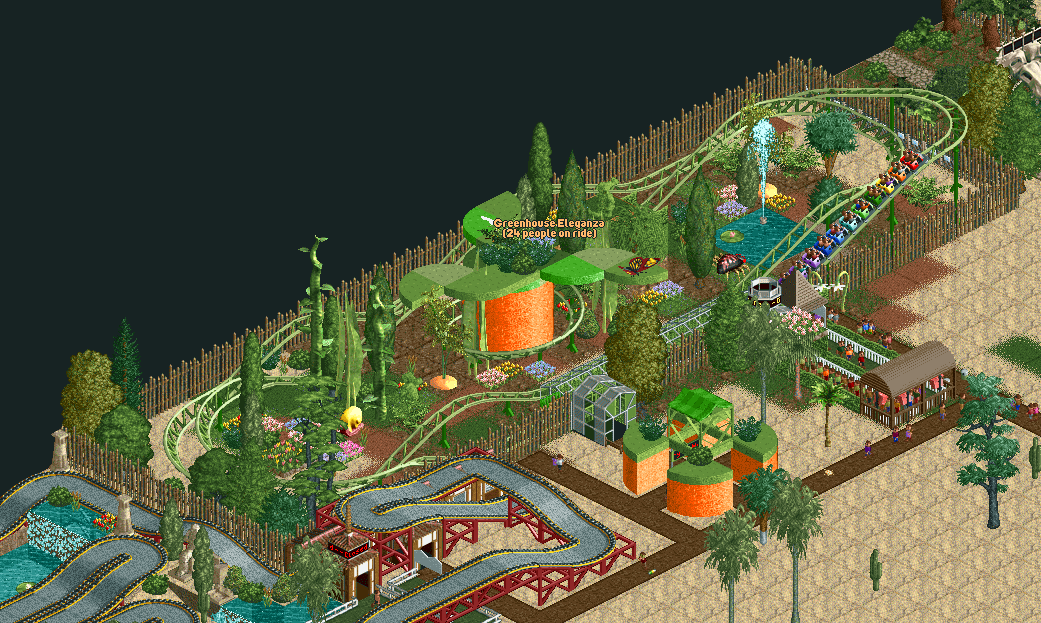
After the diamond thrill ride, this was the second ride I added to my park. It started out with a simple ovular ride to repucerate finances, and for the longest time the ride would be undecorated. But when struggling to theme another ride--a go kart ride--I found the garden theming pack and thought it was absolutely perfect for my junior coaster. Since the coaster cars are little ladybugs, I envisioned my guests as little grubs riding around in a large garden, fit with growing greens, buzzing bugs, and other garden-y things. The carrot was originally a grain silo, as you will see later in this blog post, the grain silo was one of the first major structures I learned to build and would (frankly) abuse it in many of my builds. When I finished the silo, it didn't look right so I went back over it with the paint tool, recolouring it until I found something I liked. Then bam! Orange. It's a big carrot! Perfect. I tried to warp the silo's body into a carrot, fitting it with wide spanning leaves at the top. Though I think this build is pretty, there is definitely a lottt of room for improvement! The design of the coaster itself definitely alters how you decorate it, so in the future I'll have to put a little more thought into my layout instead of just building and figuring it out later.
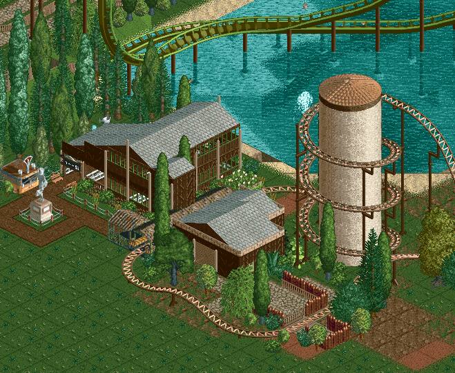
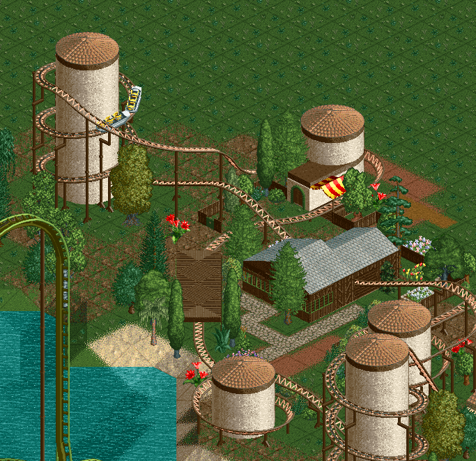
Here is the first big ride I created with the all-inspiring grain silo... It's a spiral rollercoaster whose sole chain pieces create a perfectly vertical helix that allows you to put a grain silo in the center of it. The idea of the chains clacking--click click click click--while wrapping around a circular construct has always inspired me for coaster designs. It's like ascending up the stairs of a castle on a quest to slay the dragon at the top. I find it to be parallel in excitement to the classic coaster trope of going up the large hill before flying down the slope. I find the spiral to be interesting too because it really allows you to get a 360 degree view of the park around you versus focusing purely on height and spectacle. Many of my coaster designs focus on being compact, due to my fear that I will run out of space by building too large. This fear often manifests in parks that more closely resemble computer chips or bowls of spaghetti than actual theme parks. This spiral coaster is definitely one of the prettier incarnations of this concept, as it flies through a small rustic scene, without overstaying its welcome. I built this coaster after watching a Marcel Vos video on throughput and how it can affect efficiency and subsequently profits. Though the park this was built in was done in creative mode, I wanted the most amount of people to ride it as possible, thus I tried to make something fast yet enticing to the average park goer. Which is funny, because I originally wanted to build this coaster to showcase the building that house the queue line (pic 1), but that Marcel Vos video skewed my original vision. Good thing I love the end result regardless! Though it could do with some terrain adjustments...
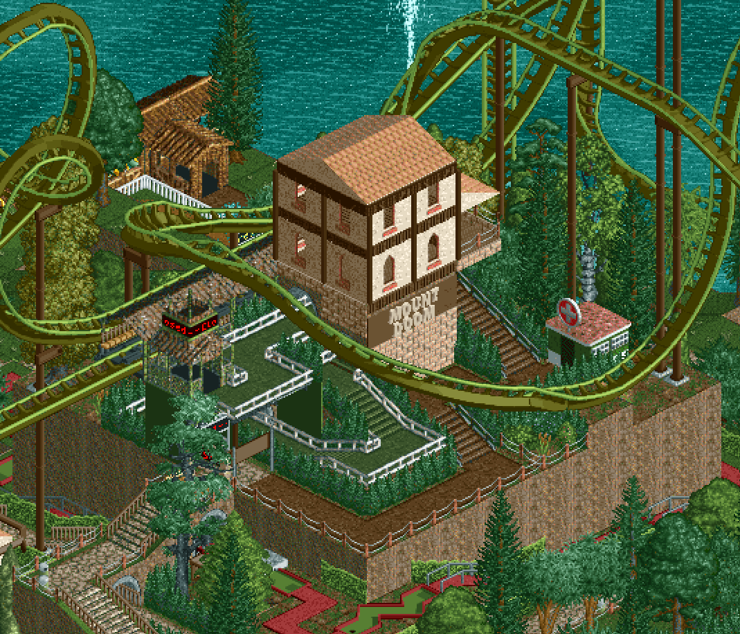
Mount Doom is a massive giga coaster sitting atop a square hill at the center of one of my parks. Around the station itself are a myriad of different coasters that serve as attractions that build up to the beast atop the mountain. Some of these are a mini golf course (intense, I know) that wraps around and through the terrain, a cliffhanger coaster, and some assorted thrill rides. Designed to be the centerpiece coaster of this massive lake, Mount Doom was eventually transformed into this idyllic green landscape that just so happened to house an intensity 10 coaster LMAO. I did not expect Mount Doom to be as intense as it was, but since it was a centerpiece coaster, I really wanted it to be something special. Thus I broke many of my typical rules, allowing myself to build a far reaching and very tall coaster that I would want to ride in real life. I would consider myself a thrill seeker in real life. I love to be scared, hurt, but most of all have adrenaline surging through my body. Mount Doom was my chance to make something that I would say "holy shit." Some rides in real life, such as X2 at Magic Mountain were hyped up by friends to be "scary" but I just found them awesome and joyous. I needed a real test of spirit...and seeing Mount Doom test, I would certainly go on it once, have my brain turned to slush then never touch it again. I think Mount Doom's theming itself could be better as the name doesn't reflect the peaceful atmosphere it's surrounded by. Additionally, I did get tired during the tail end of its development, and certain loop areas certainly show my creative fatigue. Perhaps I'll revisit Mount Doom and touch it up! But until then...I have another coaster idea to make (and eventually abandon for another newer idea).
Thanks for reading! Be mindful, I am an amateur of my craft! There are many great theme park designers out there that I draw inspiration from, please check them out as well...